17 Dark Gray Paint Colors That Designers Turn to for the Perfect Touch of Moodiness
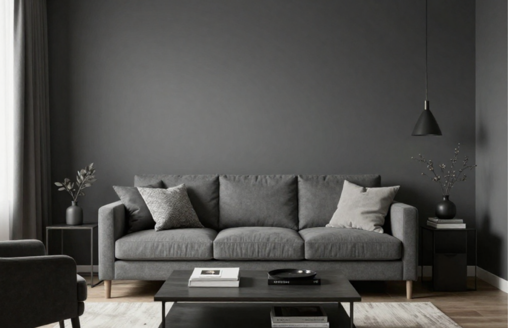
Dark gray is one of those colors designers return to again and again. It’s reliable, flexible, and far easier to live with than many people expect. When used well, dark gray can make a room feel calm, grounded, and intentional without feeling closed in.
Unlike black, dark gray still reflects light. Unlike lighter grays, it adds depth and contrast. This balance is why it works in so many spaces, bedrooms, living rooms, kitchens, offices, and even hallways.
This guide breaks down 17 dark gray paint colors designers regularly use, along with practical advice on where each one works best and what kind of look it creates.
What Makes a Dark Gray Paint Color Work
Not all dark grays behave the same way. Some lean warm, some cool, and some change depending on the time of day. Designers pay close attention to undertones and lighting before choosing one.
A good dark gray usually:
- Has enough depth to create contrast
- Doesn’t turn flat or muddy in low light
- Works with both warm and cool materials
- Looks intentional rather than heavy
Natural light, artificial lighting, flooring, and trim color all affect how dark gray shows up in a space.
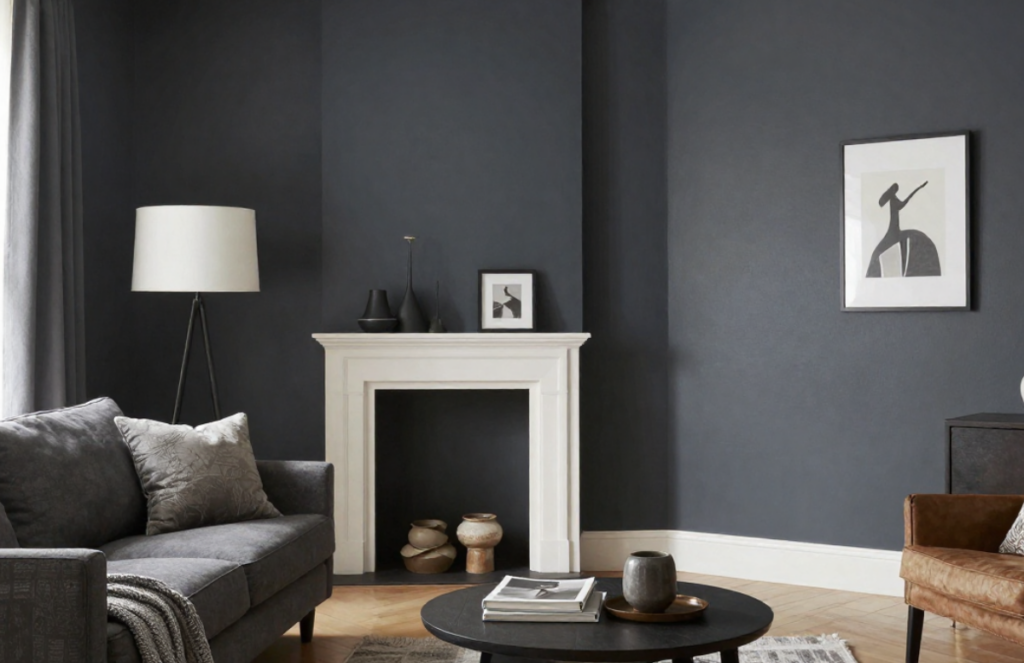
17 Dark Gray Paint Colors Designers Rely On
1. Benjamin Moore Kendall Charcoal (HC-166)
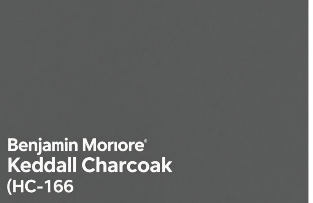
Kendall Charcoal is one of the most commonly used dark gray paint colors in interior design. It has warm undertones that keep it from feeling cold or harsh. Designers use it in living rooms, dining rooms, and open spaces to create depth without drama.
It pairs especially well with white trim, oak floors, and brass or black hardware.
2. Sherwin-Williams Peppercorn (SW 7674)
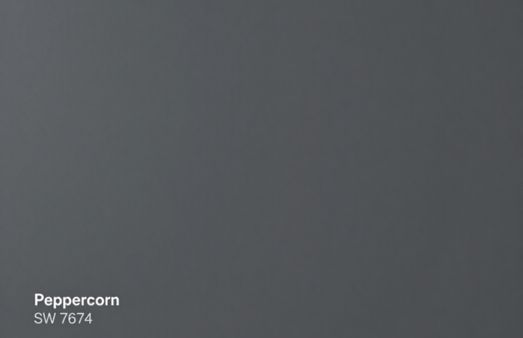
Peppercorn is a strong charcoal gray that reads clean and modern. It works well in rooms with good natural light or when used on a single wall.
Designers often choose Peppercorn for:
- Accent walls
- Interior doors
- Built-in shelving
It holds its color well in both daylight and evening light.
3. Farrow & Ball Railings
Railings are a dark gray with noticeable blue undertones. Because of that, it tends to feel cooler and more dramatic than a standard charcoal.
It’s frequently used in:
- Powder rooms
- Kitchen cabinets
- Small rooms where depth matters
Under warm lighting, the blue softens, and the color feels more balanced.
4. Benjamin Moore Iron Mountain (2134-30)
Iron Mountain is a warm, brown-leaning dark gray. It feels comfortable and grounded rather than bold.
Designers like using it in:
- Bedrooms
- Dining rooms
- Traditional or transitional interiors
It pairs well with warm woods and soft neutral fabrics.
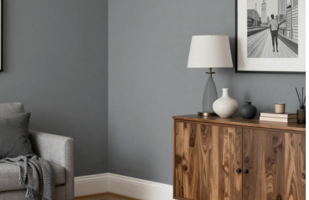
5. Sherwin-Williams Gauntlet Gray (SW 7019)
Gauntlet Gray sits in the middle of the dark gray range—not too deep, not too light. It has subtle brown undertones that help it work in many settings.
Common uses include:
- Open floor plans
- Hallways
- Exterior siding
It’s often chosen when a softer dark gray is needed.
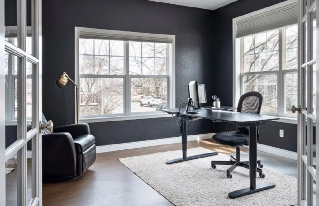
6. Farrow & Ball Down Pipe
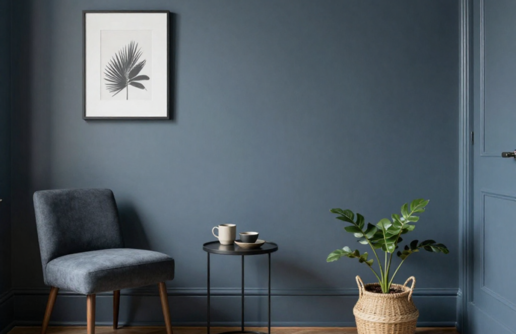
Down Pipe is a cooler charcoal gray that works well in modern homes. It responds strongly to light, appearing darker in the evening and slightly softer during the day.
Designers use it for:
- Statement walls
- Home offices
- Minimal interiors
It pairs nicely with concrete, metal, and pale wood.
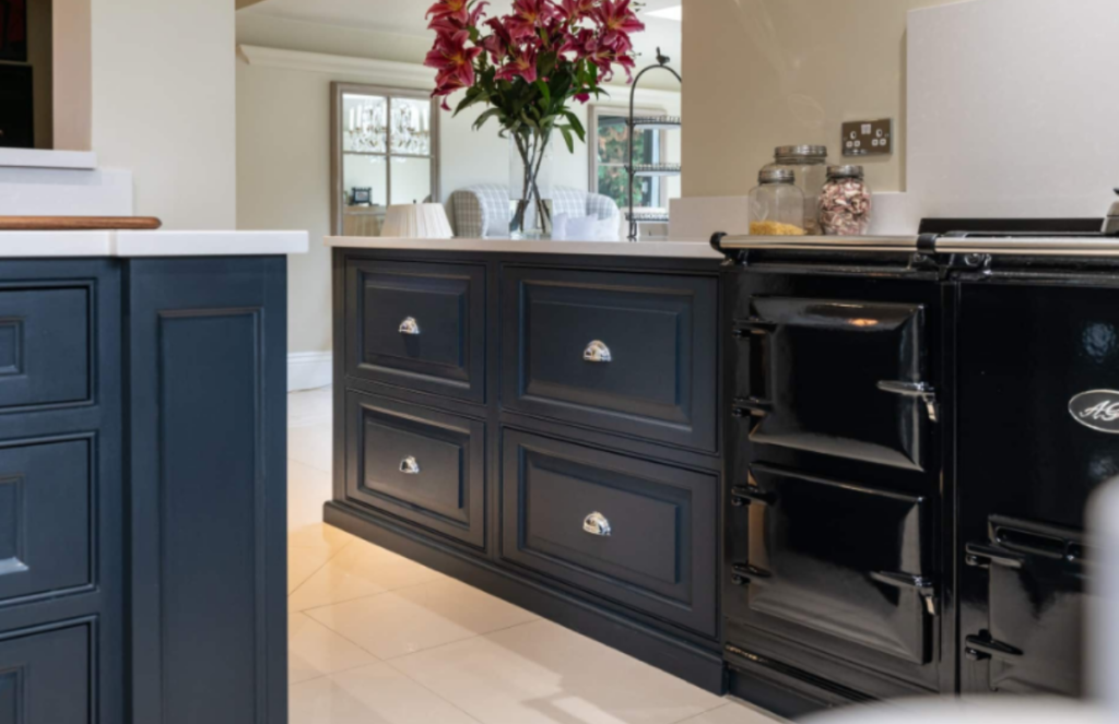
7. Benjamin Moore Wrought Iron (2124-10)
Wrought Iron sits right on the edge between dark gray and black. It’s deep but not sharp.
It’s commonly used on:
- Kitchen cabinets
- Interior doors
- Built-in storage
When paired with light countertops or walls, it feels clean and deliberate.
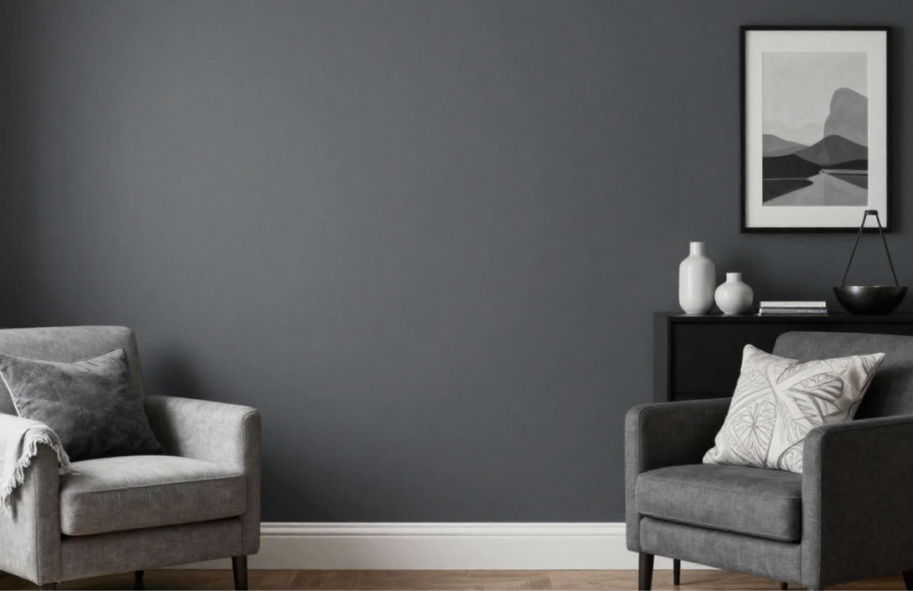
8. Sherwin-Williams Grizzle Gray (SW 7068)
Grizzle Gray has green undertones, which give it a natural, slightly aged look.
Designers often use it in:
- Libraries
- Studies
- Rooms with vintage or classic furniture
It works especially well with leather, wood, and stone.
9. Farrow & Ball Charleston Gray
Charleston Gray is warm and traditional. It feels established and steady, making it a good fit for older homes.
Common applications include:
- Dining rooms
- Entryways
- Formal living spaces
It works best with warm whites and classic trim details.
10. Benjamin Moore Graphite (1603)
Graphite is a balanced charcoal gray that doesn’t lean strongly warm or cool.
Designers like it because:
- It works with both modern and classic finishes
- It pairs well with marble and metal
- It stays consistent in different lighting
It’s a safe choice for cabinets and accent walls.
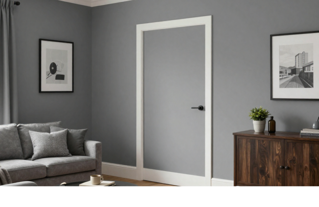
11. Sherwin-Williams Dorian Gray (SW 7017)
Dorian Gray is a popular whole-home color. It leans warm and feels familiar rather than dramatic.
It’s often used in:
- Living areas
- Bedrooms
- Open layouts
It connects well with beige, cream, and wood tones.
12. Farrow & Ball Manor House Gray
Manor House Gray feels soft and lived-in. It doesn’t demand attention, which makes it useful in larger spaces.
Designers use it in:
- Bedrooms
- Hallways
- Traditional homes
It’s a good option if you want dark gray without strong contrast.
13. Benjamin Moore Thunder (AF-685)
Thunder is a deep gray with a hint of violet. It works best in controlled lighting.
It’s often chosen for:
- Accent walls
- Media rooms
- Low-traffic spaces
It creates depth without reading as black.
14. Sherwin-Williams Tricorn Black (SW 6258)
Though it’s labeled black, Tricorn Black is frequently used as a very dark gray alternative.
Designers use it on:
- Trim
- Doors
- Architectural features
It provides a strong contrast without looking glossy or harsh.
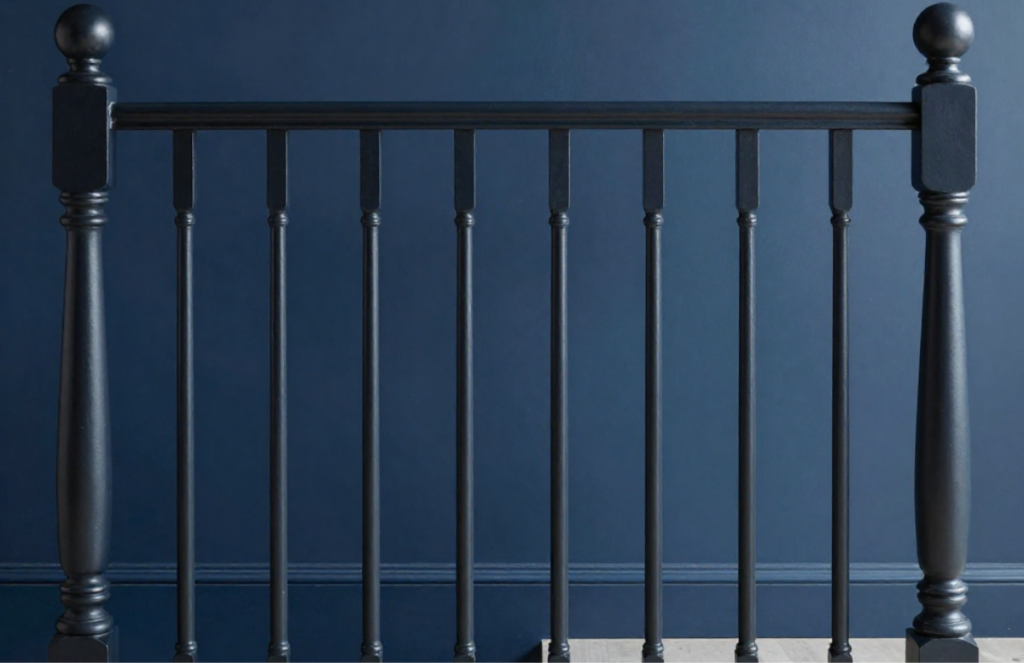
15. Farrow & Ball Off-Black
Off-Black is a soft charcoal that feels calmer than true black.
It’s commonly used for:
- Cabinets
- Stair railings
- Window frames
It works well when you want definition without sharp edges.
16. Benjamin Moore Deep Creek (2133-30)
Deep Creek is earthy and grounded, with subtle warmth.
It’s a good fit for:
- Home offices
- Media rooms
- Accent walls
It pairs well with neutral textiles and darker woods.
17. Sherwin-Williams Urbane Bronze (SW 7048)
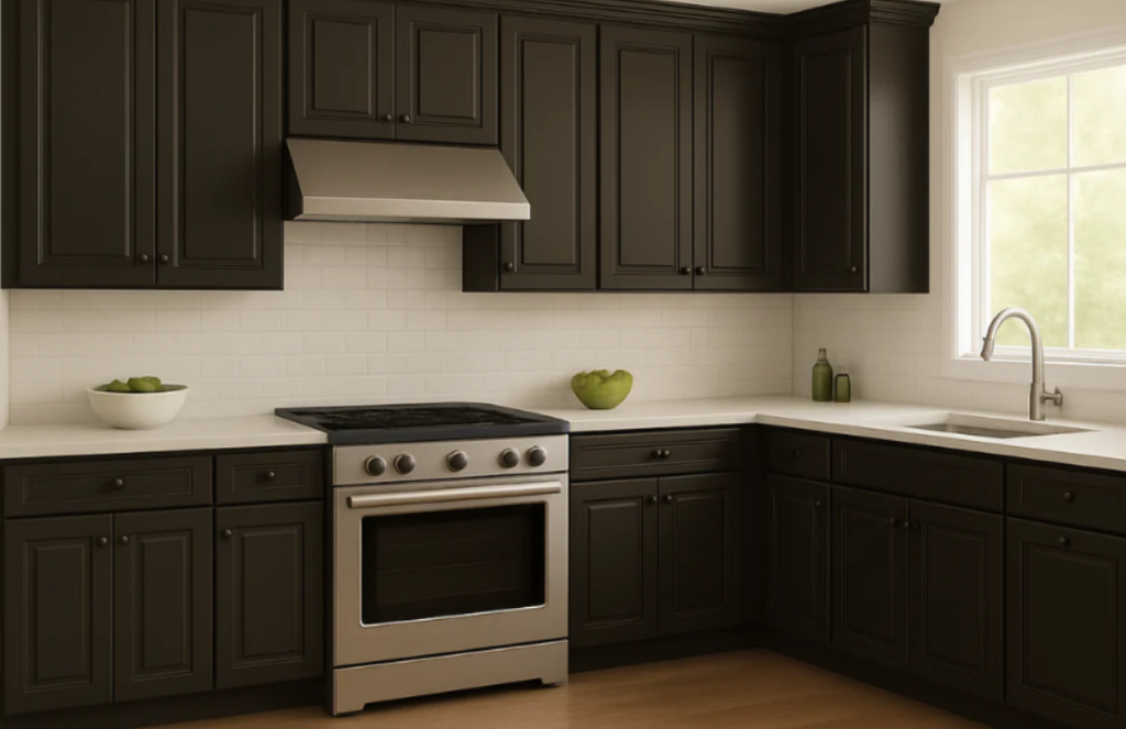
Urbane Bronze sits between dark gray and brown. It feels solid and natural.
Designers often use it in:
- Kitchens
- Entryways
- Exteriors
It works particularly well with stone, tile, and wood.
How to Use Dark Gray Without Making a Room Feel Heavy
- Always test samples on multiple walls
- Use lighter trim or ceilings to create contrast
- Layer lighting: overhead, task, and ambient
- Balance dark walls with natural materials
Dark gray works best when it’s part of a larger, thoughtful palette. Dark gray works best when it’s part of a larger, thoughtful palette. And decorating your space with this shade isn’t just about what looks good in photos; it’s also about what actually works long term. Choosing a darker paint color also means thinking long-term. Many homeowners rush into bold decor decisions and later regret them, especially when trends fade. In fact, professional designers often warn against common mistakes, something we’ve covered in detail in our guide on 11 Home Decor Choices Professional Interior Designers. This will help you to get better knowledge to decorate your home.
Final Thoughts
Dark gray paint colors remain popular because they’re practical, flexible, and visually steady. They create a mood without demanding attention and work well across many types of homes.
When chosen carefully, dark gray becomes less about trend and more about long-term use.
Related Blogs
11 Home Decor Choices Professional Interior Designers 100% Regret
Interior designers are usually polite. But get them talking off the clock and you’ll hear strong opinions about certain home decor choices. These are the...
Read more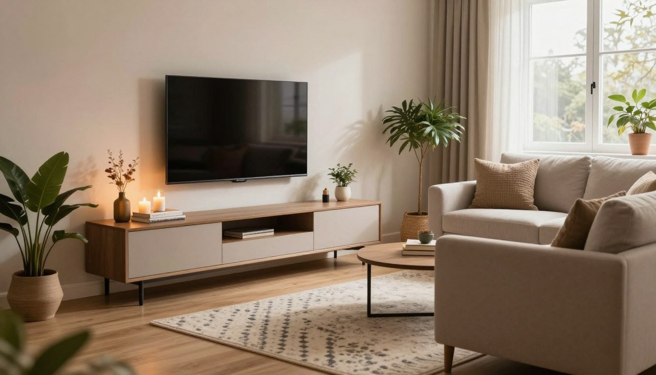
Unique Ways to Style a TV In a Small Living Room
Whether you're dealing with a cozy apartment or a compact home, there are numerous ways to elevate your TV's style without overwhelming the space. From...
Read more
This Is The Designer Secret To a Cozy, Personalized & Unique Home
There’s a specific feeling you get when you walk into a home and instantly relax. Your shoulders drop. You sit down without asking. You suddenly...
Read more